
Journal
The quiet power of a warm neutral
2 October 2026 · 4 min read
By Claire Wickstead, Interior Designer
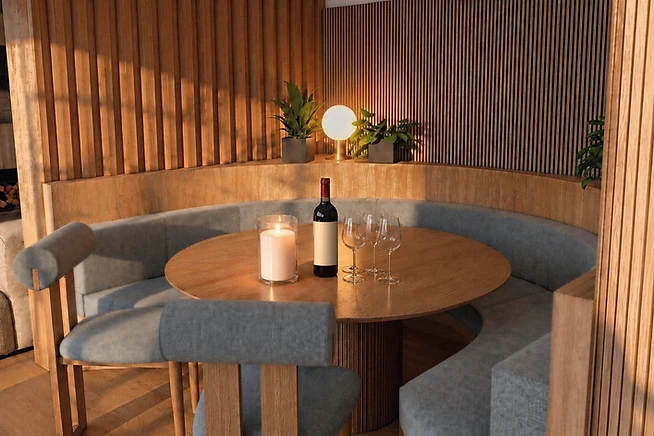
Every few years a colour is declared dead, and for a long while it was beige. Grey took over our homes, then white, then everything went moody and dark. But in the projects we take on, the rooms clients end up loving most are almost always built on a warm neutral: the colour of plaster, of undyed linen, of sand at the end of the afternoon.
A warm neutral is not the absence of a decision. It is a deliberate choice to let a room be led by texture and light instead of colour. In a British home, where daylight is soft for much of the year, a white with a cool base can read as clinical by four o'clock in January. A warm base — cream, bone, putty, a greige that leans to the brown side — holds the evening light and makes a room feel composed rather than cold.
Where most neutral rooms go wrong
A neutral scheme fails when everything matches. When the walls, sofa, rug, and curtains all sit at the same tone and the same sheen, the eye has nothing to hold onto, and the room reads as unfinished. What saves it is contrast in the places you feel rather than see: a rough plaster against a smooth wool, dark oak against pale stone, a linen that creases against a cotton that doesn't.
The trick we come back to is choosing one neutral for the room at the darkest hour of the day, not the brightest. Paint a large board, move it around the room, and look at it morning, noon, and midnight. The undertone that feels calm at all three is the one that will hold for years.
Then let the room speak in materials. Brass that tarnishes, oak that silvers, wool that softens. A warm neutral gives them the space to age in place, and a home that ages gracefully is, in the end, what everyone is asking us for.